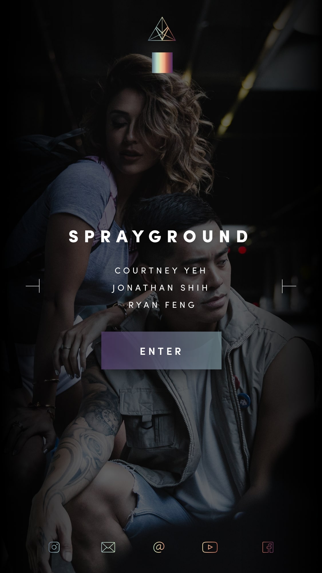
Vibrvncy represents a spectrum. Of that spectrum, each member embodies a hue and each story a different shade of that hue. Made up of not one but many stories showcasing a variety of disciplines and unfolding new perspectives. The team leverages the creative capabilities of a multidisciplinary agency to effectively showcase stories on screen, in pixels, and within space.
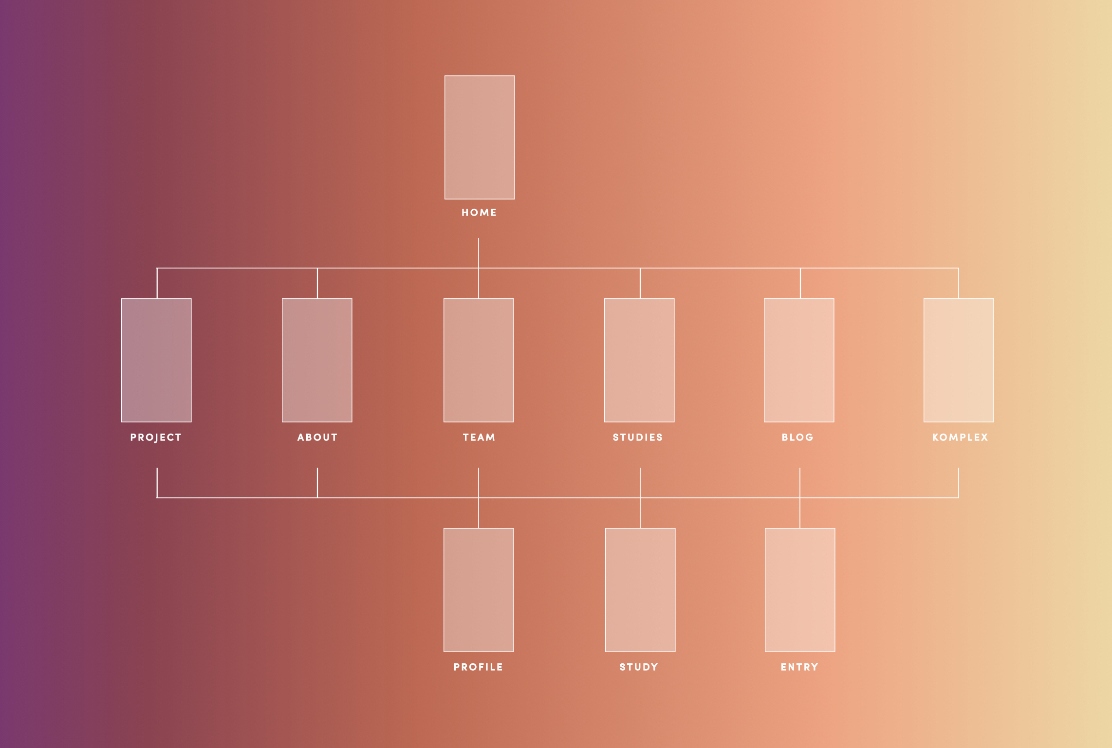
The former website hosted offset-positioned content, navigation inconsistencies, and unresponsive formatting from an off-the-shelf template.
The website redesign aligned with the collective’s aesthetic and minimal style and approach. Visuals were pushed to the forefront for a showcase-driven display of portfolio projects and also applied as backdrops to provide an immersive feel.
The objective was to apply the spectrum as a literal translation of the community and range of creativity at the heart of the Vibrvncy.
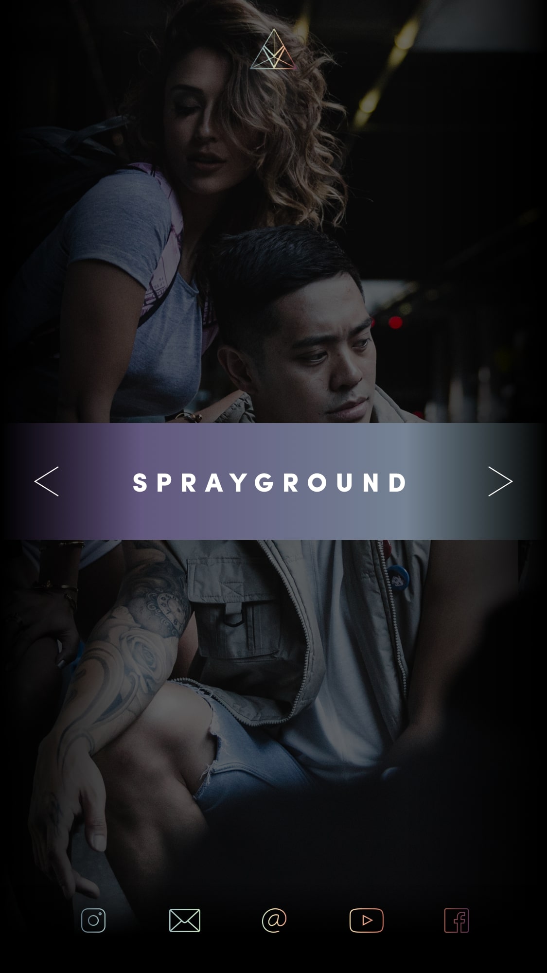
The spectrum acted as a navigation wheel and was appointed as the central form of maneuvering through each project preview. Since the logo acted as a hamburger menu icon, we decided to expand and collapse content to create a smooth transition between accessing subpages and the main project hub page.
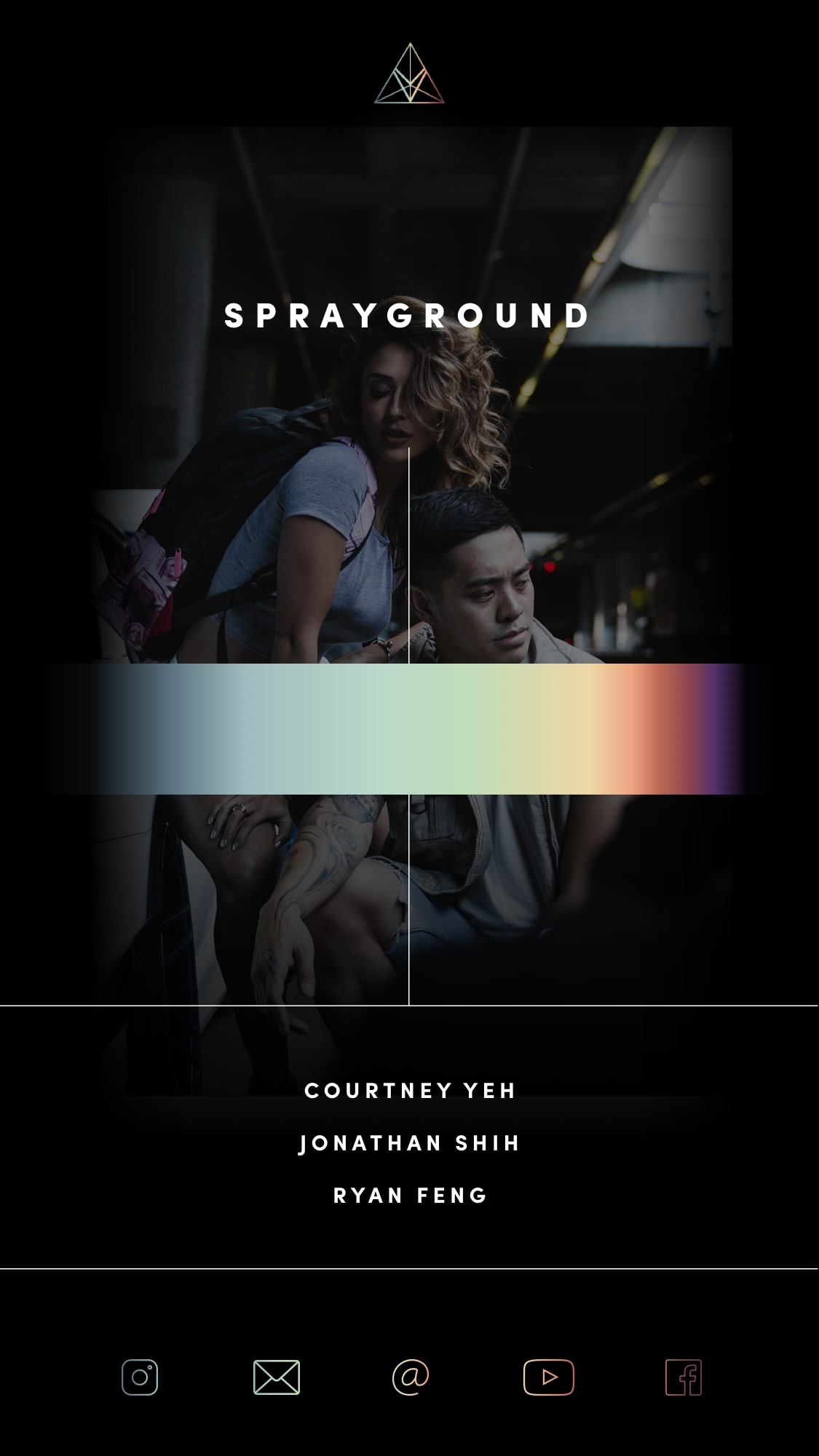
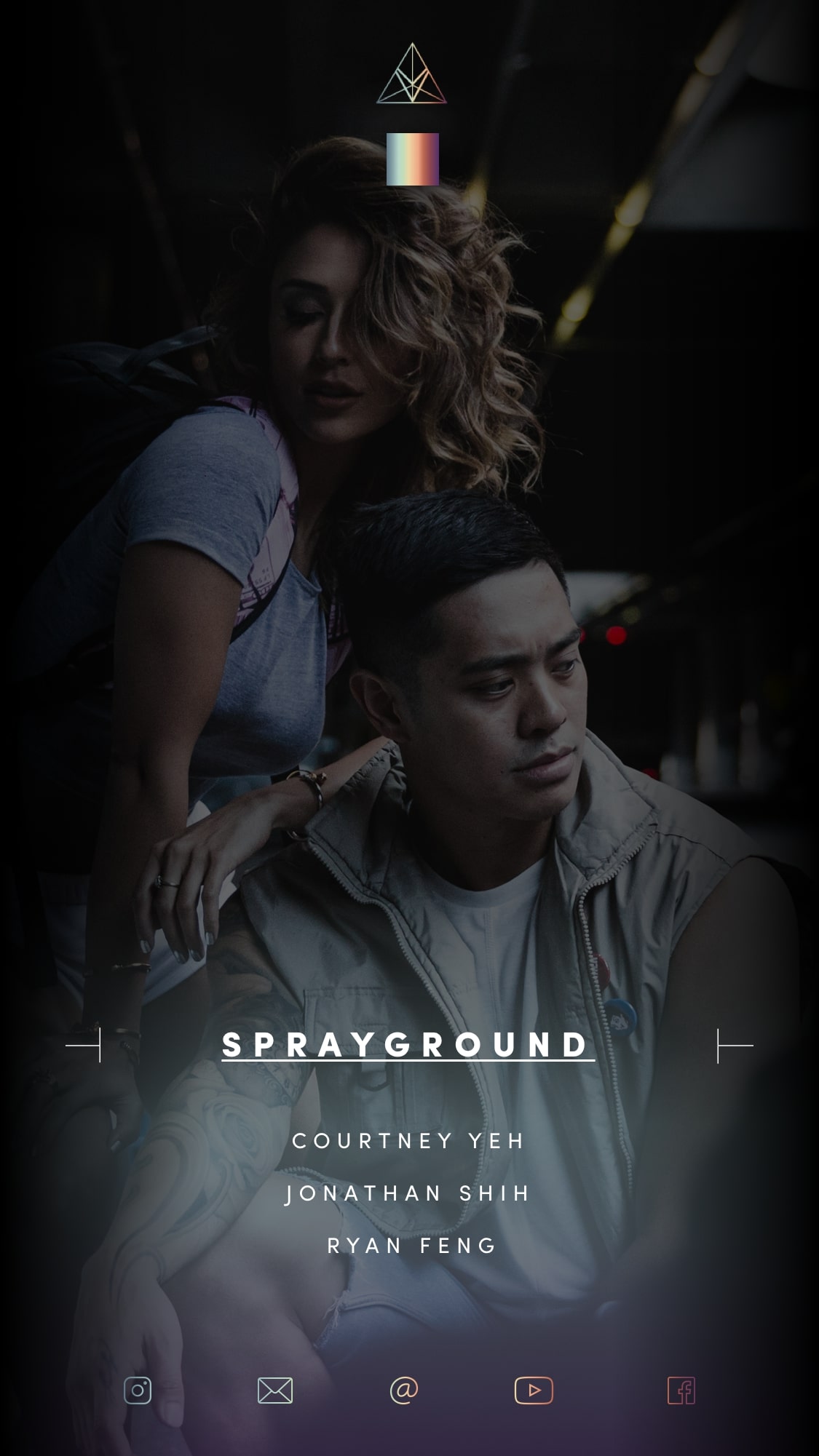
The entire site redesign was to push Vibrvncy's photography as a key asset for a very visual foreword portfolio narrative. The menu's subpages provided another opportunity to apply some visual continuity.
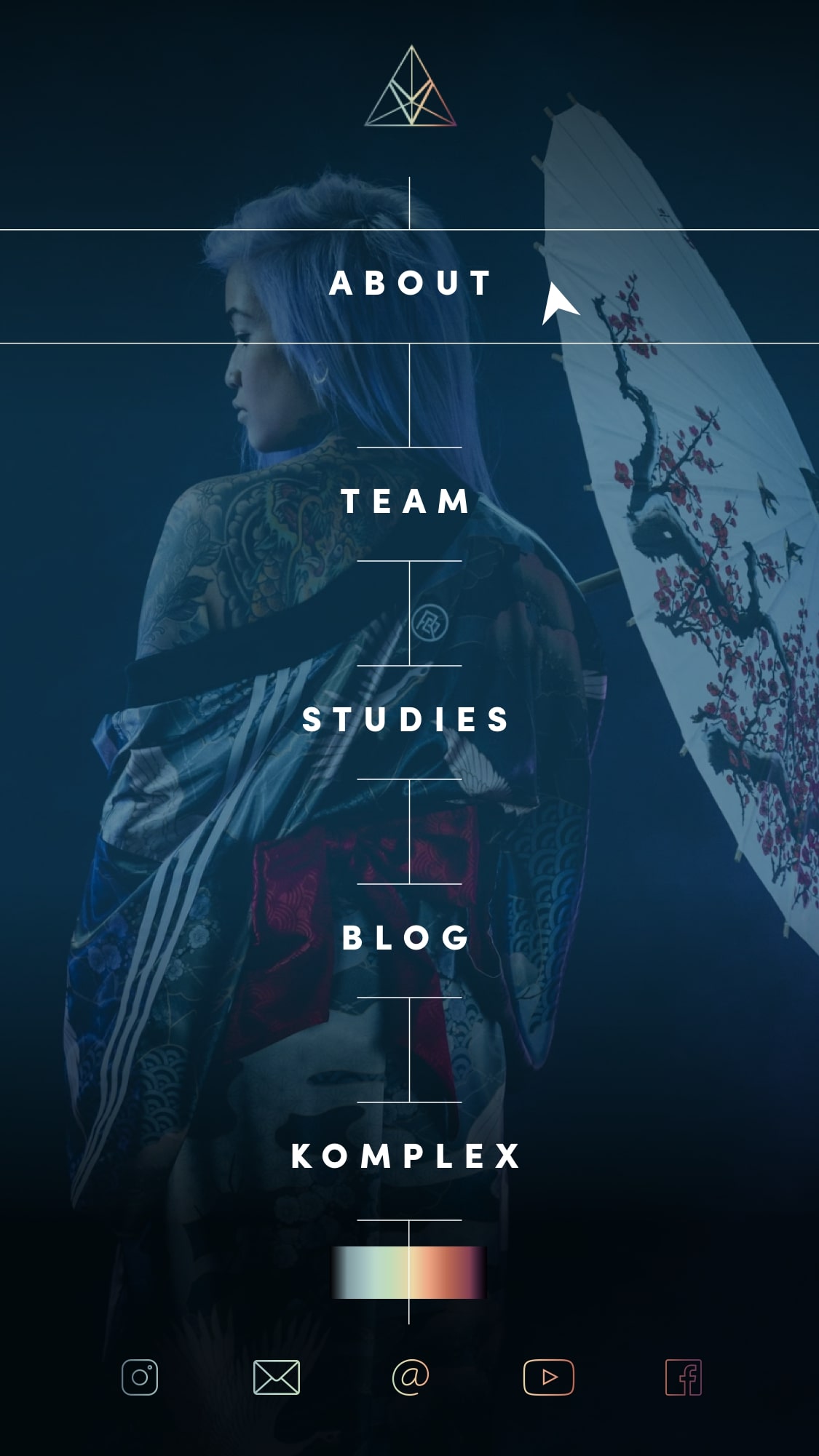
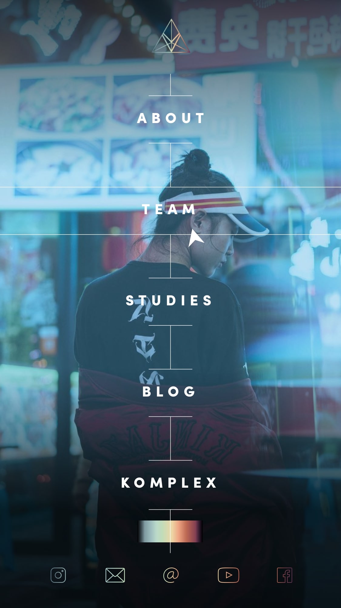
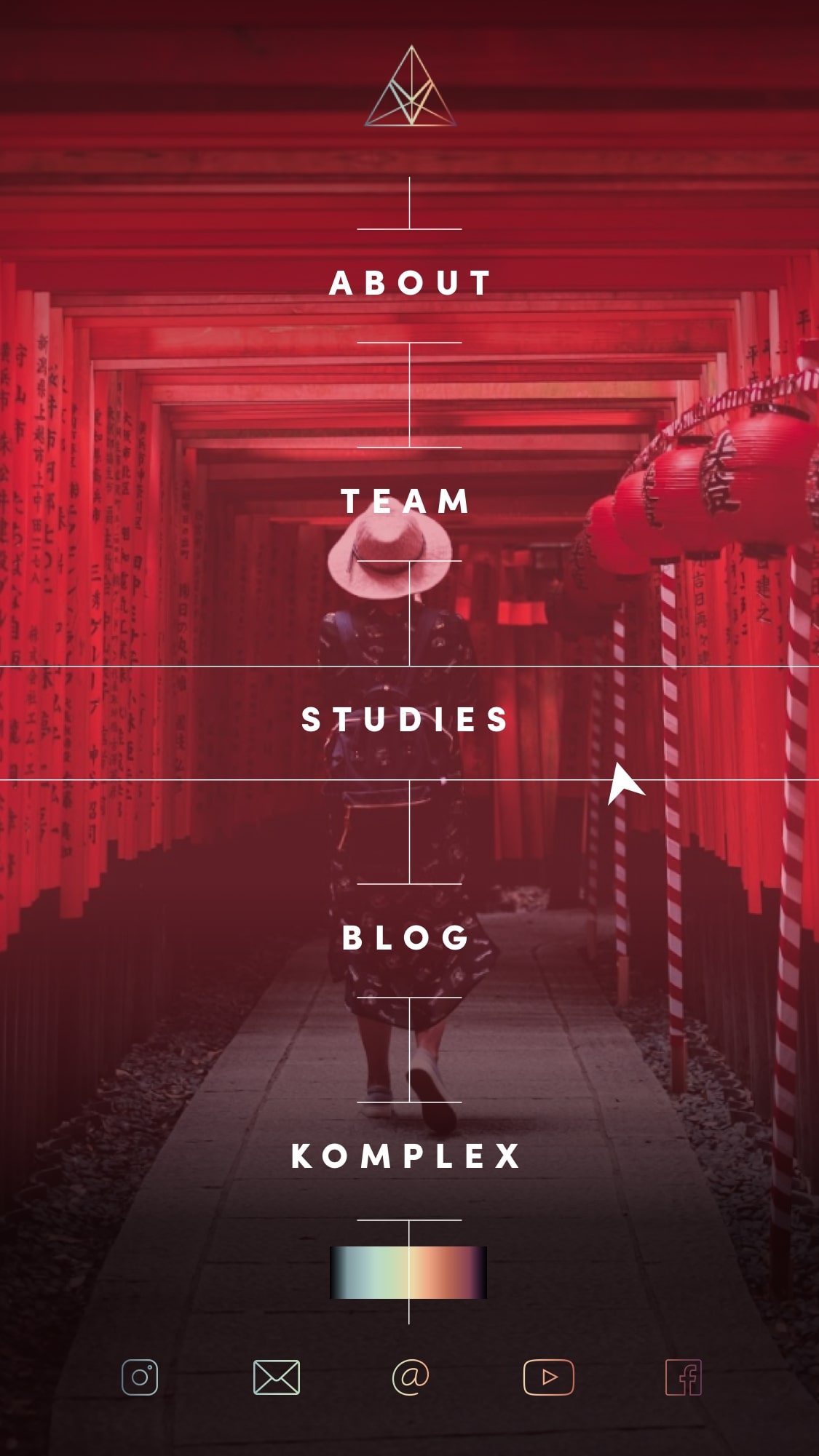
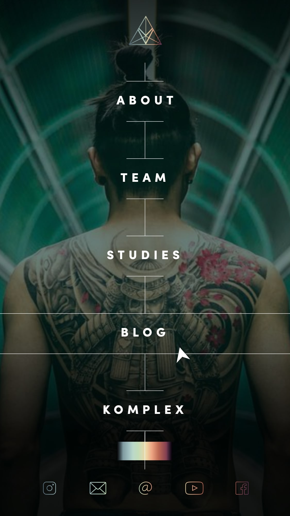
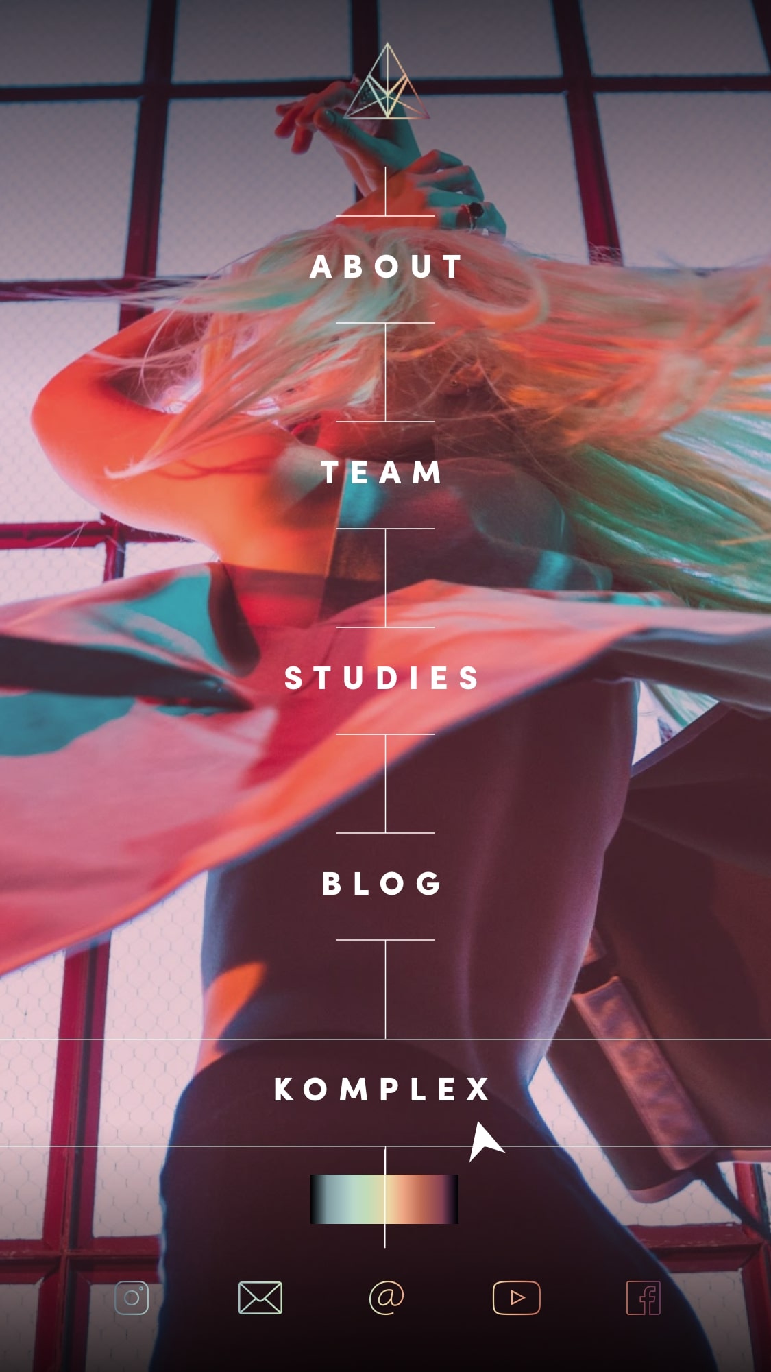
Vibrvncy is a very visual foreword brand & to honor its distinct aesthetic, textual information became a secondary focus.


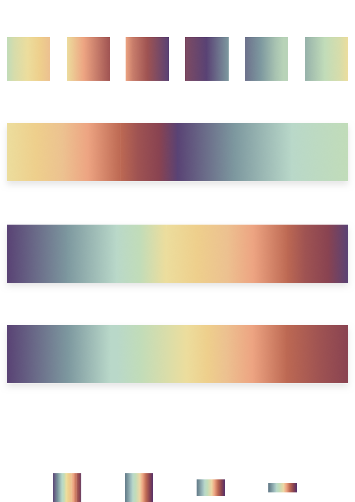
The micro interactions carried the visual elements to mimic the smooth transition & balance of the color spectrum.